
Spaghetti Diagrams Explained (With an Easy 5-Step Plan!)
All the ins and outs of spaghetti diagrams in one place (with an easy 5-step guide!).
What is a Spaghetti Diagram?
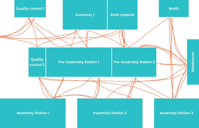
A spaghetti diagram – also known as a spaghetti plot, model, chart, or map – is a tool that visualizes operator movement. It is a map of a shop floor on which the path an operator takes to perform a certain process is drawn. Spaghetti diagrams present movement in a concrete form to open up a gateway for the analysis and improvement of shop floor processes.
Although spaghetti diagrams have a distinct purpose in different fields – from tracking the movement of butterflies to determining the severity of weather events – this article will focus on the use of spaghetti diagrams as an improvement tool in manufacturing.
What is a spaghetti diagram used for in manufacturing?
Spaghetti diagrams are most commonly used in manufacturing to streamline shop floor processes.
Spaghetti diagrams consist of spaghetti-like lines that represent the movement of operators during a particular process.
The resulting diagram allows people to see the inefficiencies that can be improved to make work flow better.
Cycle time is all-important in manufacturing; every shop floor operation and process has its own cycle time.
By reducing the cycle time of operations, you increase efficiency and, in turn, throughput. A spaghetti diagram – especially if coupled with quantitative measurements – helps you find out which operations can be improved to reduce cycle time.
Drawing up a spaghetti diagram is relatively easy.
The results can, however, be quite surprising, as it’s only natural that managers and operators have difficulty noticing the inefficiency of day-to-day processes and operations.
The spaghetti diagram allows you to see your shop floor with new eyes; suddenly, chaotic activity is crystallized in a clear, concrete form, making analysis much easier.
How do I make a spaghetti diagram?
In the following paragraphs, we’ll try to give you a sense of everything that can be involved in the making of a spaghetti diagram.
We should, however, emphasize that you do not have to apply everything contained in these steps.
Where a thorough, detailed spaghetti diagram requires the use of quantitative measurements and colored lines, a simple one could just be drawn up with a pen on the back of an envelope.
You should therefore feel free to adjust these steps as much as you want.
Remember: all plates of spaghetti are different, and the same goes for spaghetti diagrams!
1. Map the area you want to analyze
Spaghetti diagrams are fairly straightforward to draw up: you could, in theory, make one using a pencil and a napkin.
As working with a pen and paper or whiteboard and marker can get quite messy, we recommend using a tablet and stylus for a nice, streamlined result (that’s easy to store and share to boot).
In the first step of making a spaghetti diagram, you draw up a clear map of the area you want to analyze.
Make sure to include every physical object that’s in the area, even if it’s not a piece of (relevant) equipment; a spaghetti diagram should represent your entire shop floor.

2. Number everything involved in the process
Now that you have your shop floor mapped neatly, you can consecutively number all places involved in the process you want to analyze. These can be the involved equipment, but also the ancillary locations where an operator might need to go to get a tool or spare part.
3. Draw lines for every movement
When your map is drawn and your numbers are in order, it’s time to start drawing the lines.
There are several ways of doing this. You could draw one consecutive line that intersects each of the numbers. For more clarity, we recommend drawing separate lines using different colors.
This will come in handy when doing a quantitative analysis, as it allows you to present your measurements for a particular operation side-by-side with their color.
4. Optional: measure distance and time
If you want to do a thorough, detailed analysis, you might want to measure the distance and transit time involved in an operation.
You can do this by using a stopwatch and/or a measuring wheel, and the results can be tallied up in a simple diagram.
Doing this gives perspective on the overall transit time and distance of the entire process, as well as of the separate operations (e.g. going from 5 to 6 took 15 yards and 30,5 seconds).
Before going on to the next step, we should note that a thorough analysis might require you to make a spaghetti diagram several times across multiple operators.
It might be the case that the operator you picked out for your analysis was merely making an isolated mistake. Taking multiple samples allows you to see if inefficient work is a pattern.
5. Analyze your results
This step speaks for itself: after you’ve made your spaghetti diagram, you can now see what changes you can implement to make a process work better.
The nice thing about the spaghetti diagram is that it’s great for comparing your results; after you’ve implemented changes to the shop floor, you can make another spaghetti diagram to compare to the old one.
If there’s less spaghetti on the new diagram, you’ll know your efforts have been a success!
The pros and cons of spaghetti diagrams
Pros
- Very easy to make
- Makes analysis of shop floor activity easy by giving you a static overview of movement
- Can be easily stored for comparison or future reference
Cons
- Can only be used to map physical movement
Curious about the manufacturing trends that are shaping the future?

Share article: